What’s Inside
- Master the 60-30-10 Color Rule For Your Colorful Minimalist Living Room
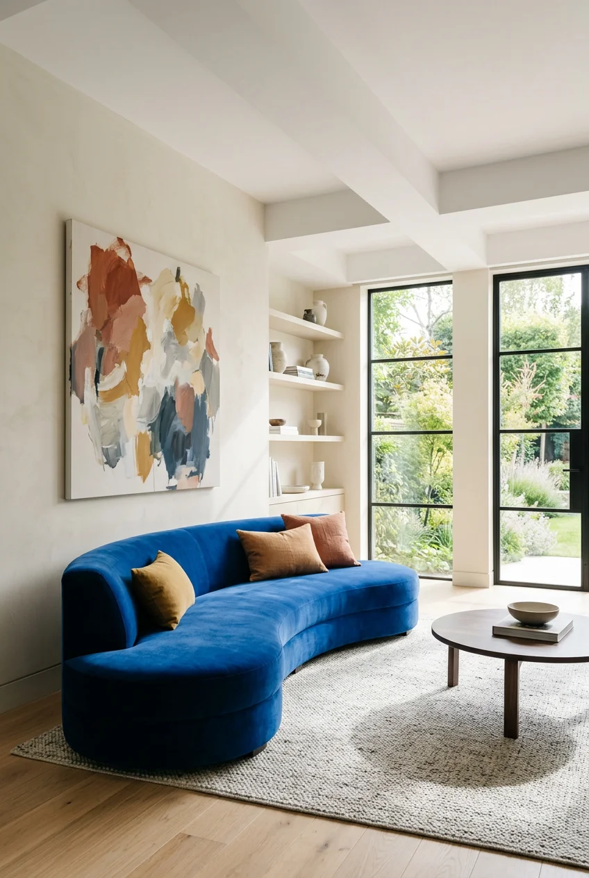
- Invest in One Statement Upholstered Piece
- Incorporate 2026 Trending Earthy and Muted Greens
- Utilize Colorful, Minimalist Art as Focal Points
- Layer Textures with Intentional Color Accents
- Add Pops of Color with Swappable Pillows
- Choose Sustainable Decor Brands with Colorful Options
- Anchor the Room with Darker, Richer Tones
- Employ Multifunctional Storage with Subtle Color
- Illuminate with Statement Lighting in Minimalist Forms
- Limit Your Palette to Avoid the Clutter Trap
- Paint the “Fifth Wall” for a Surprising Touch
- Integrate Natural Elements for Organic Color
- Paint Wall Trim in a Contrast Color
- Curate a “Conversation Piece”
- Ground the Space with a Textured Rug
- Swap Out Hardware for Warm Metallic Tones
- Use Tinted Glass Vases for Transparent Color
- Introduce Color Through Coffee Table Books
- Frame Windows in Your Colorful Minimalist Living Room
Last October, I painted my entire apartment a bright mustard yellow because a magazine promised it would be cheerful. My first attempt at a colorful minimalist living room looked exactly like a fast-food lobby. It smelled like cheap latex for three weeks, and the harsh yellow light gave me a headache every night. I learned the hard way that adding color to a minimal space requires real restraint, not just a roller and a dream. You don’t have to live in a clinical white box, but you shouldn’t feel like you’re sitting inside a candy bag, either. Here’s how I fixed my space using specific rules and pieces that add warmth without the visual noise. Let’s walk through twenty practical ways to get this balance right, keeping the floor plan open while giving your eyes something beautiful to land on. (No exaggeration.)
1. Master the 60-30-10 Color Rule For Your Colorful Minimalist Living Room

If you’re trying to figure out where to start, master the 60-30-10 rule. A colorful minimalist living room doesn’t mean equal parts of every shade on the wheel. You need a strict ratio: 60% dominant neutral, 30% secondary muted tone, and 10% accent color. I tried winging this last year and ended up with a chaotic room that made my eyes twitch. For your 60% base, paint the walls a warm neutral like Sherwin Williams’ Universal Khaki. It costs about $45 a gallon and provides a soft, earthy backdrop that doesn’t feel sterile. Introduce your 30% secondary tone through a large piece of furniture, like a pale gray or oat-colored sofa. Then, reserve that final 10% for vibrant accessories. This formula keeps the room feeling intentional. If you push that accent color to 20%, the vibe collapses. Stick to the math. Trust me.
2. Invest in One Statement Upholstered Piece

Instead of scattering ten tiny colorful items around, choose one massive piece in a bold hue. Interior designer Merrill Lyons points out that central upholstered furniture adds depth to an otherwise minimal space. A few months ago, I was browsing the West Elm showroom and realized how a single colored sofa anchors a quiet room. Consider a sofa in a rich teal. Trend forecasters at WGNS named “Transformative Teal” a major color to watch for 2026. Brands like Interior Define offer custom fabric mixing programs that let you nail this shade. Their sofas usually start around $1,500, which is steep, but the heavy texture of performance velvet hides stains brilliantly. My previous beige linen couch looked dingy after two months of coffee spills. A dark, saturated statement piece does the heavy lifting for your palette while keeping the footprint clean.
3. Incorporate 2026 Trending Earthy and Muted Greens

You can’t go wrong bringing the outside in. Muted greens are taking over, and for good reason. Sage green offers a calm, grounded balance that neon simply can’t achieve in a minimal space. I painted my built-in bookshelves with Sherwin Williams’ “Evergreen Fog” last spring. It took two $28 quarts to finish, and the smooth matte finish softened the harsh right angles of the shelving. Another great option is “Teragon,” a warm herbal green that looks incredible on baseboards. The mistake I made initially was using a high-gloss finish, which highlighted every dent in the wood and looked cheap. Stick to eggshell or matte. The flat texture absorbs light and makes the green feel like a natural shadow rather than a shiny distraction.

luckystyle Dimmable Floor Standing Tall Lamp
luckystyle Dimmable Floor Standing Tall Lamp punches above its price — 28 buyers rated it 4.5 stars. I would buy it again.
4. Utilize Colorful, Minimalist Art as Focal Points

Bare walls feel unfinished, but gallery walls often look cluttered. The sweet spot is selecting one or two large, vibrant prints. Minimalist art featuring clean lines or soft color palettes introduces personality without adding physical clutter. I bought a massive 24×36 inch abstract canvas from Target last Tuesday for $85, and it instantly tied my blue rug and gray sofa together. Look for pieces from independent brands like CreativefloArt or Aureous. They sell contemporary prints, usually priced around $56 to $120 for smaller framed pieces. The trick is leaving plenty of white space within the frame itself. I highly recommend using a thick, 3-inch white mat board. It gives the eye a place to rest and separates the bold colors from the wall paint. Don’t skip the matting. Art pushed to the edge of a frame looks messy.
5. Layer Textures with Intentional Color Accents

A flat, smooth room feels like a waiting room. You have to layer textures to keep a minimalist space from feeling cold. Colony founder Jean Lin advises using heavy, tactile fabrics to bring warmth into sparse layouts. I keep a thick, ribbed throw blanket draped over my reading chair. Right now, the 2026 trending colors are burgundy, oxblood, and burnt caramel. A heavy amber throw over a neutral sofa warms the room instantly. Brands like Parachute Home sell Oeko-Tex certified textiles that are soft and ethically made. Their throws typically run between $100 and $200. I bought their oversized linen throw in a deep rust color. It weighs about three pounds, giving it a comforting, weighted feel. One warning: linen sheds like crazy for the first three washes. I learned that the hard way. Wash it alone a few times before you put it on your furniture.
6. Add Pops of Color with Swappable Pillows

If you’re terrified of committing to a bold sofa, use throw pillows. Interior designer Nadia Watts always suggests starting with pillows and accent lighting because they provide low-commitment color. You can swap them out when you get bored. Aim for two or three 20×20 inch pillows in your 10% accent color. I grab my pillow inserts from IKEA (the FJÄDRAR duck feather inserts are only $10 and karate-chop perfectly). Then, I buy colorful linen covers from Etsy. Right now, I have two mustard yellow covers that cost $24 each. The rough texture of the linen contrasts beautifully with my smooth leather chair. Don’t buy cheap polyester. They look shiny and flatten into sad pancakes after two weeks. A well-stuffed, textured pillow in a bright hue like terracotta adds a punch of color you can hide in a closet if you want an all-neutral room next season. You might also like: 18 True Summer Capsule Wardrobe You Need to See

CEMABT Modern Nordic Boho Vase Set
A dependable everyday pick — CEMABT Modern Nordic Boho Vase Set – Elegant Beige Matte Ceramic Home pulls in 984 ratings at 4.5 stars. Not flashy, just solid.
7. Choose Sustainable Decor Brands with Colorful Options

Conscious living and minimalism go hand in hand. When you’re only buying a few items, you can afford to care about where they come from. I prefer selecting decor from eco-friendly brands that offer rich color palettes, not just beige and gray. GOODEE is a fantastic marketplace that sells home goods made with fair-trade practices. They have these incredible, tightly woven baskets from Ghana that come in vibrant blues and pinks. The Citizenry is another great option for handcrafted, responsibly sourced items. I bought a hand-loomed wool lumbar pillow from them for $135. It has a deep indigo dye that smells faintly of natural earth and wool. Yes, these pieces cost more than big-box store equivalents, but the dyes are richer and the construction is solid. You aren’t just buying a colorful object. You’re buying functional art that won’t end up in a landfill next year. You might also like: 18 Timeless Capsule Wardrobe for Every Budget
8. Anchor the Room with Darker, Richer Tones

People think minimalism means everything has to be blindingly white. That’s a myth. Darker colors add sophistication and visual weight to a sparse room. Interior experts predict deep, earthy tones like rusty browns and dark reds will dominate living spaces in 2026. I recently swapped out my flimsy glass coffee table for a solid, dark walnut wood table I found at a vintage market for $150. The heavy, dark wood grounded my seating area. You can also achieve this with an area rug in a deep plum or burgundy. A dark base color hides dirt—a lifesaver if you have a dog—and makes the lighter furniture pop. Just don’t put dark colors on every surface. A dark rug under a dark table with a dark sofa will turn your living room into a cave. Balance one heavy, dark element against your lighter walls. You might also like: 15 Cozy 2026 Capsule Wardrobe Ideas That Are Totally Worth It
9. Employ Multifunctional Storage with Subtle Color

Visual clutter is the enemy of minimalism. You need storage that hides your everyday mess while blending into your design. Look for storage ottomans or sleek sideboards that offer a subtle hint of color. I highly recommend the Karlsson sideboard from Swoon. It mixes warm mango wood with brass detailing and costs around $850. The natural variation in the wood grain acts as a subtle color element on its own. If you want something cooler, look for wall-mounted cabinets in light gray or slate blue. I installed a $200 floating gray cabinet from CB2 under my television last year. It holds all my ugly router cables and video games. The trick is avoiding hardware that sticks out. Push-to-open doors keep the front profile flat. I originally bought a cabinet with chunky handles and it caught on my sweater every time I walked past. Keep the lines clean and let the cabinet’s color do the talking.

2 Pcs Natural Wood Arch Decor
If you want something that just works, 2 Pcs Natural Wood Arch Decor is a safe bet (49 reviews, 4.5 stars).
10. Illuminate with Statement Lighting in Minimalist Forms

Lighting isn’t just functional. It’s a huge opportunity to introduce color and sculptural form. A statement chandelier with clean lines or an accent lamp with a colored base acts as a focal point even when turned off. Brands like Visual Comfort & Co. design incredible monochrome fixtures with strong silhouettes. I splurged on a $450 matte black and brass floor lamp from them, and the warm light it casts changes the mood of my living room at night. If you want a punch of color, look for a pendant light with a colored glass shade. A smoky amber or pale green glass adds a transparent layer of color that doesn’t feel heavy. Just use warm white LED bulbs (around 2700K). I accidentally put a cool white 4000K bulb in a green glass lamp once, and my room looked like a hospital cafeteria. Warm light makes colorful glass glow beautifully.
11. Limit Your Palette to Avoid the Clutter Trap

The fastest way to ruin a minimal aesthetic is to throw the entire rainbow at it. A common mistake is using too many competing colors, which makes a space feel busy even if you don’t have much furniture. Color specialist Amy Wax emphasizes that colorful minimalism is about the strategic positioning of bold colors in a quiet space. Limit your palette. Stick to a maximum of three main colors, including your neutral base. In my living room, I strictly use warm white, olive green, and burnt orange. That’s it. When I go to Target and see a gorgeous navy blue pillow for $15, I have to walk away. It doesn’t fit the palette. If you bring in a fourth or fifth color, your eyes won’t know where to rest. Pick three colors, write them on a sticky note, and don’t buy anything that doesn’t match.
12. Paint the “Fifth Wall” for a Surprising Touch

Everyone forgets about the ceiling, but interior designer Nicole Cohen suggests painting it a paler shade of a bright hue. It’s a brilliant way to add personality without cluttering your eye-level view. For 2026, a soft ice blue or muted sage on the ceiling is refreshing. I tried this in my small den last winter. I painted the walls a crisp white and the ceiling a pale terracotta pink (Behr’s “Seaside Villa,” about $35 a gallon). The process was miserable. Paint dripped in my hair, my neck cramped, and I had to use layers of plastic drop cloths. But the result was stunning. It creates an enveloping effect that makes the ceiling feel higher. The color reflects downward, casting a warm, flattering glow. If you’re tired of standard accent walls, grab an extension pole and tackle the fifth wall instead.

Gold Leaf Home Decor Set – Metal Leaves Statues
If you want something that just works, Gold Leaf Home Decor Set – Metal Leaves Statues is a safe bet (55 reviews, 4.5 stars).
13. Integrate Natural Elements for Organic Color

You don’t always have to rely on paint for color. Bring in greenery with indoor plants or select wooden pieces with natural oak coloring. Plants introduce a vibrant, living green that complements any minimalist palette. I bought a 7-foot Fiddle Leaf Fig from Costco for $60 last summer. I put it in a simple, unglazed ceramic pot I found at Walmart for $14. The massive, glossy green leaves act as a huge block of color, but because it’s natural, it doesn’t feel like visual clutter. The organic shape of the branches breaks up the rigid, straight lines of my modern furniture. A quick warning: Fiddle Leaf Figs are dramatic. If you move them two inches away from their preferred window, they drop half their leaves in protest. If you lack a green thumb, a high-quality artificial olive tree from Crate & Barrel (around $200) offers the same color benefit with zero maintenance.
14. Paint Wall Trim in a Contrast Color

Instead of painting an entire wall, try accenting with colorful trim. Kristy Howe, VP of Marketing at Andersen Corporation, notes that this approach creates a modern, luxurious design. It frames your windows and doors like art. If your walls are a warm neutral like Benjamin Moore’s Swiss Coffee, consider painting the baseboards in a muted heritage green like Farrow & Ball’s “Calke Green.” I did this in my hallway, and the contrast is breathtaking. Farrow & Ball paint is expensive (around $130 a gallon), but you only need one quart to do the trim in a standard room. The rich, chalky finish of the green against the creamy white walls looks custom. Use painter’s tape meticulously. I tried to freehand the edge near the carpet and ended up with a permanent green smudge on my rug. Tape it off, press the edges down firmly, and enjoy the contrast.
15. Curate a “Conversation Piece”

Color specialist Amy Wax advises making your accent piece worth talking about. Don’t just buy a random blue plastic bowl because you need something blue. Choose an item that is unique, sculptural, and sparks interest. This could be a vintage ceramic vase in a vibrant chartreuse or a bizarre lamp. I spend weekends scouring local antique shops for these. Last month, I found a heavy, asymmetrical glass bowl in a shocking cobalt blue for $45. I placed it in the center of my bare oak coffee table. Because the rest of the room is so quiet, that single blue bowl commands total attention. It feels intentional, like a gallery display. When you only have a few items on display, they have to carry their weight. Don’t waste your surface space on generic, mass-produced decor. Hunt down that one weird, beautiful piece that makes the room sing.

PoKat 23" Modern Ceramic Table Lamp Set of 2 for Living
PoKat 23″ Modern Ceramic Table Lamp Set of 2 for Living Room White Des has been one of the most consistently praised picks in this category. 15 reviewers averaged 4.5/5.
16. Ground the Space with a Textured Rug

Rugs are the anchor of any living room, and they offer a massive canvas for color. If your walls and sofa are neutral, a vibrant rug changes the space without taking up vertical volume. I used to have a plain cream rug, and it showed every speck of dust and dog hair. I finally swapped it for a washable Ruggable rug in a faded Persian pattern featuring deep reds and navy blues. An 8×10 foot size runs about $400. The low pile keeps it looking sleek and minimal, while the rich colors hide everyday dirt. The best part is the texture. Even a flat-weave rug adds warmth to a room with wood floors. Make sure all the front legs of your furniture sit on the rug. I used to float a tiny 5×7 rug in the middle of my room, and it made the space look like a dollhouse. Go big.
17. Swap Out Hardware for Warm Metallic Tones

Metals count as colors in a minimalist scheme. If your room feels flat, look at your hardware. The silver brushed nickel knobs that came with your media console are probably dragging the aesthetic down. Swapping out hardware is the cheapest, fastest way to inject warmth. I ordered a set of unlacquered brass cabinet pulls from an Etsy seller for $35. I unscrewed the boring silver knobs on my TV stand and popped the brass ones on in ten minutes. The warm, golden tone adds a rich pop of color that catches the light. Over time, unlacquered brass develops a dark, moody patina that looks expensive. You can also find great brass pieces at HomeGoods if you dig through the clearance bins. Just avoid cheap, shiny gold spray paint. It looks like plastic up close and chips the second you bump it with a vacuum.
18. Use Tinted Glass Vases for Transparent Color

Solid, opaque objects can feel too heavy in a minimalist room. If you want a lighter touch, use tinted glass. Transparent color adds depth because it lets light pass right through. I have a collection of three amber glass vases that I found at Goodwill for $4 each. I cluster them on my windowsill. When the afternoon sun hits them, they cast a warm, glowing caramel light across the white walls. It’s a dynamic, shifting pop of color that doesn’t take up visual weight. You can also find great tinted glass pieces at IKEA, like their $15 green glass water pitchers that double perfectly as vases. I keep one filled with $5 eucalyptus branches from Trader Joe’s. The green glass highlights the natural stems without overpowering them. It’s a subtle, airy way to introduce a new hue without committing to a heavy block of fabric.
19. Introduce Color Through Coffee Table Books

Books are the ultimate minimalist decor because they’re functional. A stack of large, vibrant coffee table books introduces strong geometric blocks of color. I rely on art and photography books from publishers like Phaidon and Taschen. They usually cost between $50 and $80, but they feature stunning, saturated covers. I bought a gorgeous cookbook from Whole Foods for $35 just for its bright yellow spine. I have a bright orange architecture book and a deep blue ocean photography book stacked on my media console. You can rotate them depending on what colors you want to highlight. The mistake I made early on was buying fake, hollow decor books. They felt cheap, looked shiny, and blew off the table when I opened a window. Buy real books. The paper adds weight and texture, and a stack of three colorful books is the only styling you need.
20. Frame Windows in Your Colorful Minimalist Living Room

Window treatments are a huge missed opportunity for color. A lot of minimalists leave their windows bare, which can make a living room feel like a sterile office. Framing your windows with muted linen curtains softens the harsh architectural lines and introduces a massive vertical block of soft color. I bought a set of heavyweight linen blend curtains from Quince in a beautiful terracotta shade. They cost $90 per panel and hang perfectly straight. I hung the matte black curtain rod about six inches above the window frame and extended it a foot on either side. This makes the windows look twice as large and lets in maximum light. Don’t buy cheap, shiny blackout curtains from big-box stores. They look like shower curtains. You want fabric that has natural texture. The warm terracotta fabric glowing in the morning sun changes the energy of the room.
Creating a colorful minimalist living room doesn’t mean you have to compromise on clean design. It’s all about making deliberate choices with your palette and textures. I spent months getting this wrong, buying random bright items that just created noise. Once you stick to the 60-30-10 rule and invest in a few high-quality, textured pieces, the whole space will finally feel cohesive and inviting. Don’t rush out and buy everything at once. Add one statement piece or a few tinted glass vases, and live with them for a week. I highly recommend pinning this guide to your Pinterest board so you can reference these specific paint colors and brand recommendations the next time you’re standing confused in a furniture aisle.
Frequently Asked Questions
How do you add color to a minimalist living room?
Stick to the 60-30-10 rule. Use a neutral base for 60% of the room, a muted secondary tone for 30%, and reserve 10% for a bold accent color through items like a statement sofa, tinted glass vases, or textured throw pillows.
What are the best colors for a colorful minimalist living room?
Earthy, muted tones work best. For 2026, trend forecasters recommend warm neutrals like Universal Khaki paired with transformative teal, sage green, and deep rusty browns. These shades add warmth without creating visual clutter.
Can a minimalist room have bright colors?
Yes, but they must be used strategically. Limit your bright colors to one or two accent pieces, like a large abstract art print or a single brightly colored chair, keeping the surrounding walls and floors strictly neutral.
How many colors should be in a minimalist room?
You shouldn’t exceed three main colors in a minimalist space. This includes your dominant neutral wall color, a secondary furniture tone, and one distinct accent color. Adding more than three colors quickly makes the room feel chaotic.
