What’s Inside
- Embrace 2026’s Trending Hues as Your Foundation
- Implement the 60/30/10 Rule for Color Harmony
- Choose Multi-Functional Furniture with Subtle Color
- Introduce Color Through Easily Changeable Textiles
- Curate Art as a Bold Focal Point
- Don’t Shy Away from Colorful Statement Lighting
- Layer Textures to Add Depth and Warmth
- Integrate Strategic Restorative Darks for Grounding
- Use Colorful Accessories from Design-Forward Brands
- Paint Interior Doors for an Unexpected Pop
- Avoid the Matchy-Matchy Trap
- Incorporate Green as a Versatile Neutral
- Prioritize Functionality in Kitchen and Bathroom Accents
- Don’t Underestimate the Power of Plants in Colorful Pots
- Adopt the One In, One Out Philosophy
- Keep Your Colorful Surfaces Perfectly Clean
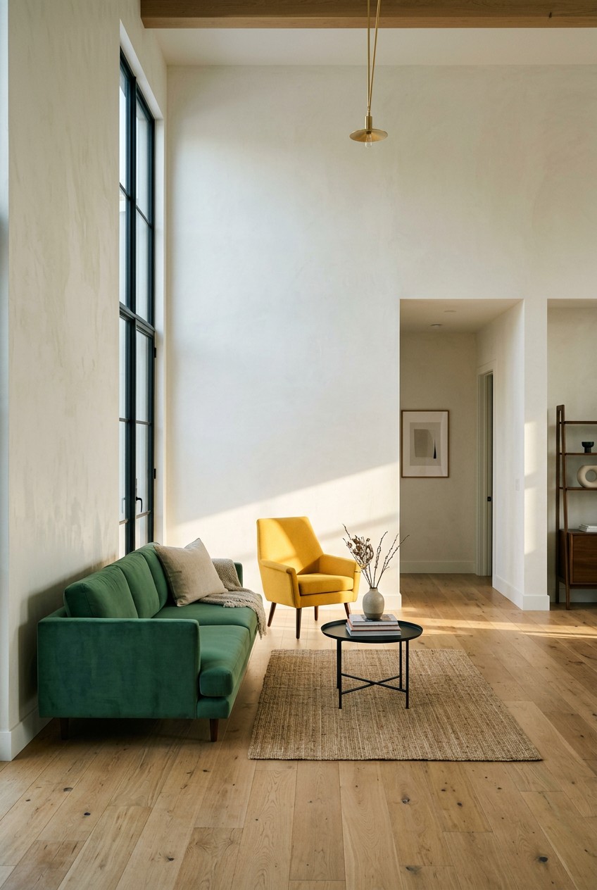
I sat on my beige sofa last Tuesday, staring at my beige walls and drinking beige oat milk, when I realized my living room looked like a bowl of cold oatmeal. I spent months doing the stark white aesthetic all wrong before I finally figured it out. My first attempt at a peaceful sanctuary felt sterile, cold, and honestly sad. Building a colorful minimalist home doesn’t mean you have to live inside a chaotic kaleidoscope. It means choosing vibrant hues with strict intention. I’m Ava, and I’ve spent the last three years turning boring, clinical spaces into cozy, vibrant sanctuaries without adding a single piece of useless clutter. We aren’t going to buy fifty useless knick-knacks. I learned that the hard way. Instead, we’re going to use paint, textiles, and highly functional pieces to inject life back into your rooms. Skip the all-white rules. They make your house look like a dentist’s office. Let’s look at the exact products, paint colors, and strict rules I personally swear by for creating a space that feels both incredibly calm and wonderfully alive.
1. Embrace 2026’s Trending Hues as Your Foundation

Let’s talk about the base of your colorful minimalist home. I used to paint everything stark hospital white. Big mistake. It shows every dirty fingerprint, and honestly, it feels freezing cold in the winter. Now, I swear by nuanced neutrals. Benjamin Moore’s Silhouette AF-655 is a deep, velvety brown with charcoal undertones that costs about $64.99 per gallon. I used exactly two gallons in my den last month. It pairs beautifully with their Swiss Coffee OC-45 for the baseboards and trim. If you want something a bit lighter, Sherwin-Williams Universal Khaki (HGSW6150) is a warm neutral that grounds a space perfectly for $59.00 a gallon at Lowe’s. I bought a 2-inch angled Purdy brush at Walmart for $12.48 to cut in the ceiling edges. The sharp, chemical smell of fresh paint mixed with the earthy khaki tone instantly made the room feel cozy but incredibly clean. Skip the ultra-bright whites. They reflect too much blue light from your windows. A grounded, earthy base lets your colorful minimalist home breathe.
2. Implement the 60/30/10 Rule for Color Harmony

Most people get this completely wrong. I definitely did. I once threw five bright colors into my tiny bedroom and it felt like sleeping inside a bag of Skittles. To avoid aggressive visual clutter, you need the 60/30/10 rule. That means 60 percent dominant color, 30 percent secondary color, and 10 percent accent color. For my kitchen remodel, I used 60 percent Swiss Coffee on the drywall. Then I painted my lower cabinets with 1 gallon of Benjamin Moore’s Raindance 1572, a steely green that costs $64.99. Finally, my 10 percent accent is a set of four 8-ounce terracotta mugs I scored at Target for $5.00 each. The rough, chalky texture of the terracotta against the smooth green cabinets looks absolutely incredible. When I drink my morning coffee, the visual balance actually calms my brain. If you ignore this strict ratio, your colorful minimalist home will quickly turn into a chaotic mess.
3. Choose Multi-Functional Furniture with Subtle Color

Minimalism prioritizes hardcore purpose. You can’t just buy pretty things that sit there collecting dust. I learned that the hard way when I bought a bright pink decorative chair that was too uncomfortable to actually sit on. I ended up donating it to Goodwill three weeks later. Instead, opt for furniture that works hard. I picked up the IKEA Besta TV stand for $249.00. It measures exactly 71 inches wide, 15 inches high, and 16.5 inches deep. I chose the glossy olive green finish. It holds my 55-inch TV, hides all my ugly black cables, and stores exactly 12 board games completely out of sight. The glossy finish reflects the afternoon sunlight beautifully across my floor. You can even wall-mount it to keep your floor space completely clear. I used a $15.99 stud finder from Home Depot to hang mine. It gives the room a massive pop of color without adding useless clutter.

PoKat 23" Modern Ceramic Table Lamp Set of 2 for Living
PoKat 23″ Modern Ceramic Table Lamp Set of 2 for Living Room White Des punches above its price — 15 buyers rated it 4.5 stars. I would buy it again.
4. Introduce Color Through Easily Changeable Textiles

Committing to a bright green sofa is terrifying. I won’t do it. If you hate it six months later, you’re stuck with a massive, expensive mistake. That’s why I introduce color through textiles. Last Saturday at IKEA, I grabbed a 6 by 8 foot Langsted area rug for $79.99. It features a blocky geometric design with pink, blue, green, orange, and yellow. The low-pile synthetic fibers feel slightly scratchy on bare feet, but it vacuums beautifully. This one rug anchors my entire living space and gives me five different colors to pull from for small accents. When winter comes, I roll it up and swap it for a solid cream wool rug. I also keep two 20-inch velvet throw pillow covers from Target ($12.00 each) in a deep mustard yellow. They take up zero storage space when folded flat in my linen closet. You can change the entire mood of your room in five minutes flat.
5. Curate Art as a Bold Focal Point

A gallery wall with thirty tiny frames is my personal nightmare. It looks incredibly cluttered and requires dusting a million little ledges every week. Instead, curate art as a bold focal point. I buy digital downloads from Etsy. You can search for colorful minimal art and find gorgeous, massive abstract prints. I bought a geometric terracotta and navy print for exactly $6.50. I sent the file to Walgreens and had it printed on a 24 by 36 inch matte poster board for $29.99. I framed it in a thin black $35.00 Target Room Essentials frame. Hanging one massive piece of art with clean lines injects huge personality into an empty white wall. The matte finish of the poster prevents annoying glare from my living room windows. It draws the eye immediately. Don’t scatter tiny bits of color everywhere. Consolidate your color into one giant, intentional statement piece. You might also like: 15 Clever Minimalist Living Home Tips You Haven’t Thought Of
6. Don’t Shy Away from Colorful Statement Lighting

Lighting is crucial. If your lighting is bad, your minimalist space will feel like a sterile waiting room. Overhead fluorescent lights are the absolute worst. I rely heavily on colorful statement lighting to warm things up. I keep the IKEA FADO table lamp on my desk. It costs $29.99 and looks like a glowing glass orb. But my absolute favorite piece is the IKEA SPETSBOJ lamp. It costs $19.99 and comes in this trendy, soft butter-yellow color. It measures just 11 inches tall, making it perfect for a cramped nightstand. The metal shade feels cool and smooth to the touch, and it casts a warm, downward puddle of light that’s perfect for reading. I use a 40-watt equivalent warm white LED bulb ($4.99 for a two-pack at Kroger). The yellow base adds a cheerful pop of color during the day, even when the lamp is turned off. You might also like: 20 Charming Minimal Classic Capsule Wardrobe Ideas That Actually Work

Dog Sculpture Home Decor Cute Man and Dog Statue Decoration
Dog Sculpture Home Decor Cute Man and Dog Statue Decoration for Office has been one of the most consistently praised picks in this category. 326 reviewers averaged 4.5/5.
7. Layer Textures to Add Depth and Warmth

A common mistake in minimalist design is forgetting texture. If everything is smooth plastic, glass, and flat paint, the room feels freezing. I lived in a living room like that for a year, and it literally echoed when I talked. You must layer textures. I mix materials like rough linen, scratchy wool, and smooth porcelain. I bought a heavy cotton throw blanket from Ferm Living for $115.00. It measures 47 by 63 inches and features a deep rust color with thick, chunky fringe. Draping that heavy, textured fabric over my smooth leather sofa instantly warms up the visual space. I also keep a 6-inch raw clay vase I found at Sprouts for $14.99 on my coffee table. The gritty, unglazed exterior of the clay contrasts beautifully with the soft blanket. Your hands should want to touch the different surfaces in your room. You might also like: 20 Beautiful Capsule Wardrobe Ideas for Any Style
8. Integrate Strategic Restorative Darks for Grounding

Bright colors need dark anchors, or they just float away and feel chaotic. Sherwin-Williams calls these restorative darks. We’re talking shadowed gold, dark plum, and nocturnal blues. I painted my small hallway in Benjamin Moore’s Narragansett Green HC-157. It costs $64.99 a gallon and looks like a blackened teal. The dark paint makes the narrow hallway feel like a cozy, moody tunnel instead of a dead space. I also upcycled an old wooden dresser using 1 quart of HGTV Home by Sherwin-Williams Griffin (HGSW7026) for $22.98 at Lowe’s. It’s a rich, dark taupe. The dark taupe grounds my bright white bedroom walls. When I open the smooth, freshly painted drawers to grab my socks, the dark color feels incredibly grounding. Don’t be afraid of dark paint. As long as you have decent natural light, a dark accent wall adds massive depth without creating physical clutter.
9. Use Colorful Accessories from Design-Forward Brands

You don’t need fifty cheap knick-knacks. You just need three really good ones. I select a few high-quality items that serve a daily purpose. The brand HAY makes incredible functional pieces. I bought their Colour Rack, designed by Muller Van Severen, for my bare entryway. It costs $195.00 and I chose the Maroon Red option. It’s made of powder-coated steel and feels incredibly sturdy. I hang my winter coats on their matching Dijon Yellow Colour Hangers, which come in a set of three for $15.00. The contrast of the bright yellow plastic hangers against the deep red steel rack makes me smile every time I walk through my front door. It holds exactly four coats and two bags. Nothing more. By choosing brightly colored, highly functional pieces, you completely eliminate the need for useless decorative objects.

UTTCMK Bookshelf Decor Thinker Statue
A dependable everyday pick — UTTCMK Bookshelf Decor Thinker Statue – Abstract Art Reading Thinker S pulls in 771 ratings at 4.5 stars. Not flashy, just solid.
10. Paint Interior Doors for an Unexpected Pop

Here’s a trick most people completely ignore. Paint your interior doors. I kept my bedroom walls a basic Swiss Coffee white, but I painted the inside of my bedroom door a bright, mustard yellow. I used 1 quart of Behr Premium Plus interior satin paint from Home Depot for $19.98. I applied it with a 4-inch foam roller ($6.48) to get a perfectly smooth, factory-like finish without ugly brush strokes. It took exactly two coats. When the door is open, you barely notice it from the hallway. But when I close the door at night to sleep, I get this massive, cheerful slab of color. It takes up zero floor space. It doesn’t clutter my walls with frames. It just sits there, looking brilliant. Pull a color from your 10 percent accent palette and try this on a bathroom or closet door.
11. Avoid the Matchy-Matchy Trap

I used to buy everything in the exact same shade of navy blue. Navy rug, navy pillows, navy curtains. It looked like a cheap catalog from 2012. You must avoid the matchy-matchy trap. If you strictly repeat the exact same three colors everywhere, the room feels stiff and boring. You need intentional contrast. I started mixing tones that feel slightly absurd together. I paired a pale lavender throw pillow ($15.00 at Target) with a burnt orange ceramic tray ($22.99 at World Market). The trick is to ensure each color appears at least twice in the space, even in tiny doses. I keep a tiny lavender candle ($4.99 at Trader Joe’s) on my bookshelf to echo the pillow. The orange tray matches the terracotta pots on my windowsill. This creates a dynamic, layered look that feels collected over time.
12. Incorporate Green as a Versatile Neutral

If you’re terrified of bold colors, start with green. Honestly, this changed how I view color completely. The right shade of green acts exactly like a neutral. I used to think gray was the only safe option, but gray can feel incredibly depressing in winter. I painted my bathroom vanity with 1 quart of Benjamin Moore’s Raindance 1572 for $24.99. It’s a soft, steely green with heavy gray undertones. The chemical smell of the primer was awful, but the final result was worth a mild headache. I swapped the old hardware for two brushed brass pulls I found at Home Depot for $6.98 each. The cool green tones make the warm brass pop beautifully. Green brings the feeling of nature indoors. It pairs perfectly with white towels, wood accents, and literal houseplants. It’s the safest way to step out of your beige comfort zone.

seenlast Candle Warmer Lamp with Timer Dimmer Adjustable
A dependable everyday pick — seenlast Candle Warmer Lamp with Timer Dimmer Adjustable Height for Ne pulls in 38 ratings at 4.5 stars. Not flashy, just solid.
13. Prioritize Functionality in Kitchen and Bathroom Accents

Even your ugly, everyday items can be beautiful. I used to hide my cheap plastic showerhead. Now, I use a bright yellow filtered showerhead from Sproos!. It costs $85.00 and took me exactly four minutes to twist onto my shower pipe. The water pressure is amazing, and the bright yellow silicone feels soft and grippy. In my kitchen, I threw away my mismatched plastic measuring spoons. I replaced them with a $10.00 set of colorful glass spoons from IKEA. They clink together with this satisfying, high-end sound when I stir my morning coffee. They look like handmade art glass, but they cost next to nothing. By upgrading the items you touch every single day, you inject joy and color into your routines. You don’t need a drawer full of useless gadgets. Just buy the colorful, upgraded version of the basics.
14. Don’t Underestimate the Power of Plants in Colorful Pots

Plants are the ultimate minimalist decor. They clean the air and add literal life to a dead room. Last Tuesday at Whole Foods, I bought a sprawling Golden Pothos for $14.99. The deep green leaves looked amazing, but the cheap plastic nursery pot was tragic. I immediately repotted it into a 6-inch matte coral ceramic planter I grabbed at Target for $12.00. I used exactly 2 cups of Miracle-Gro indoor potting mix ($6.48 at Walmart). The contrast between the bright green vines and the matte coral geometric pot is stunning. I water it once a week, and the damp earth smell makes my kitchen feel fresh. Stick to simple, geometric pots without crazy patterns. Let the bright, solid color of the pot do the heavy lifting. A few well-placed plants in vibrant pots completely cure a boring corner.
15. Adopt the One In, One Out Philosophy

If you just keep adding colorful things, you aren’t a minimalist anymore. You’re a hoarder with good taste. I strictly follow the one in, one out philosophy. I keep my personal belongings capped around 500 items. When I decided to buy a bright cobalt blue electric kettle from Costco for $39.99, my old, ugly stainless steel kettle had to go. I donated it immediately. The new blue kettle boils exactly 4 cups of water in under two minutes, and the bright blue metal looks incredible sitting on my bare white quartz counter. This strict rule forces you to be incredibly intentional. You won’t buy a cheap, ugly red vase if it means you must throw away a book you love. It protects your physical space and ensures every single colorful item in your home actually earns its keep.
Beautiful Decorative Books
Beautiful Decorative Books – Set of 2 Boxes Enhance Your Coffee Table has been one of the most consistently praised picks in this category. 282 reviewers averaged 4.5/5.
16. Keep Your Colorful Surfaces Perfectly Clean

Let’s talk about maintenance. Having a colorful minimalist home means the few items you own are constantly on display. Dust shows up terribly on dark, vibrant surfaces. I ruined a gorgeous matte black side table by using harsh chemical cleaners that stripped the finish. Now, I only use a damp microfiber cloth. I bought a 12-pack of bright yellow Zwipes microfiber cloths on Amazon for $11.99. I mix exactly 1/2 cup of distilled white vinegar ($3.29 at Kroger) with 2 cups of warm water in a glass spray bottle. I mist the cloth, not the furniture. This gently removes dust and fingerprints from my olive green TV stand and my terracotta pots without fading the vibrant colors. If your colorful pieces are covered in a thick layer of gray dust, the entire minimalist illusion falls apart. Keep your surfaces wiped down.
Building a colorful minimalist home takes real time. You can’t just run to Target and buy twenty bright things in one afternoon. I tried that, and I ended up returning everything two days later because it looked insane. Start incredibly small. Paint a single interior door, buy a bright yellow showerhead, or invest in one massive piece of art. Trust me, waking up in a space that feels both calm and vibrantly alive is entirely worth the effort. It changes your entire mood. Pin this guide for your next weekend project, take it one room at a time, and let me know which bold color you decide to try first!
Frequently Asked Questions
What is a colorful minimalist home?
A colorful minimalist home blends the uncluttered, functional principles of minimalism with intentional pops of vibrant color. Instead of stark white walls, it uses rich neutrals, colorful statement furniture, and bold art to create a warm, personalized space without physical clutter.
How do I add color without making my room look cluttered?
Follow the 60/30/10 rule. Use a neutral color for 60% of the room, a secondary color for 30%, and a bold accent color for 10%. This strict ratio keeps the visual weight balanced and prevents the space from feeling chaotic.
What are the best paint colors for a minimalist aesthetic?
Skip stark hospital whites. Opt for nuanced neutrals like Benjamin Moore’s Silhouette or Swiss Coffee. For subtle color, steely greens like Raindance or warm taupes work beautifully as grounding shades that won’t overwhelm a simple space.
Can I use dark colors in a minimalist space?
Yes. Integrating restorative darks like blackened teal or deep plum adds necessary depth and grounds the room. Use dark colors strategically on accent walls, interior doors, or painted furniture to create contrast against lighter minimalist elements.