What’s Inside
- Anchor With Warm Neutrals
- Position Bold Color Pops Strategically
- Stick To The Rule Of Three
- Soften The Room With Biomorphic Shapes
- Layer Textures To Avoid Flatness
- Use Accent Furniture As Focal Points
- Introduce Non-Permanent Textiles
- Layer Warm LED Lighting
- Curate Art Carefully
- Bring In Natural Greenery
- Hide Clutter In Minimalist Storage
- Paint Unexpected Spots
- Follow The 60/30/10 Ratio
- Display Cherished Objects Sparingly
- Use Wall Murals For Large-Scale Color
- Display Colorful Glassware On Open Shelving
- Ground The Space With Statement Rugs
- Stack Colorful Books Deliberately
- Paint Your Interior Doors
Last October, I painted my living room mustard yellow and it looked like the inside of a giant hot dog bun. I dropped $150 on fancy paint and burned three days of manual labor only to prime over it because the visual noise gave me a migraine. That disaster taught me a harsh lesson about colourful minimalist decor. It isn’t about drenching a room in pigment until your eyes hurt. It’s about restraint and precise placement. If you’re tired of living in a beige box but terrified of creating a chaotic funhouse, you need a system. I’ve spent two years figuring out how to add color without losing the quiet energy of a pared-down space. The secret is treating color as a deliberate architectural feature rather than an afterthought. Let’s break down how to nail this balance without repeating my mustard yellow mistake. (Learned that the hard way, no exaggeration.)
1. Anchor With Warm Neutrals

Start by skipping the stark whites. I painted my hallway pure white last year, and it felt like a sterile dental clinic. The cold overhead lighting made the walls look bluish and uninviting. The current shift toward warm minimalism relies on earthy neutrals like coffee, mushroom, or clay. These tones give you a quiet backdrop that lets colourful minimalist decor do its job without fighting the walls. I used Benjamin Moore Revere Pewter HC-172 in my current living room. It costs about $75 a gallon. The greige shade has a slight warmth that keeps the room from feeling flat, especially in the afternoon when the sun hits the west-facing window. If you go too cool with your grays, any bright accent looks jarring and disconnected. A warm neutral base absorbs some of that visual shock. It makes a bright red vase or a mustard pillow look intentional rather than accidental. I learned this the hard way after trying to make a neon pink print work against a blue-gray wall.
2. Position Bold Color Pops Strategically

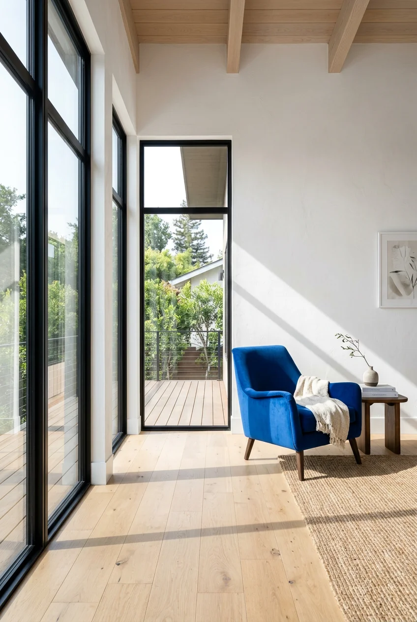
Color specialist Amy Wax notes that colorful minimalism requires strategic placement of bold colors within an otherwise quiet space. Instead of spreading tiny bits of color on every surface, you group them for impact. In my office, I have a standard gray desk and white walls. I added a 12-inch teal blue neon clock that cost $45.99 from a local hardware store. That single item draws the eye immediately. When you scatter color everywhere, the brain doesn’t know where to look. I used to put one red book on a shelf, a red coaster on the table, and a red frame on the wall. The room just looked messy. Now, I pick one specific zone for a saturated hue. The teal clock emits a soft hum and casts a slight blue glow on the wall at night, adding texture without taking up physical space. It’s a highly controlled application of color.
3. Stick To The Rule Of Three

To keep a minimalist space from feeling chaotic, you need a strict limit on your palette. Interior designer Melissa Roberts suggests keeping it to two or three colors max beyond your neutral base. I strictly follow this in my bedroom. My base is a soft oatmeal color. My three accents are muted olive green, burnt orange, and navy blue. If I bring in a bright purple throw blanket, the entire room feels off-balance. I bought a cheap yellow vase at a thrift store once, thinking it wouldn’t matter. It threw off the whole visual weight of the dresser, and I ended up donating it two weeks later. When you limit yourself to three colors, shopping becomes much easier. You automatically filter out items that don’t fit the scheme. I keep a small digital mood board on my phone with the exact hex codes of my three colors so I don’t make impulsive mistakes when I’m out shopping.

CEMABT Modern Nordic Boho Vase Set
CEMABT Modern Nordic Boho Vase Set – Elegant Beige Matte Ceramic Vase has been one of the most consistently praised picks in this category. 993 reviewers averaged 4.5/5.
4. Soften The Room With Biomorphic Shapes

Minimalist silhouettes are softening, moving toward rounded corners and circular nesting tables. These biomorphic shapes help slow down a room visually. Sharp, rigid lines can feel aggressive, especially when paired with bold colors. I recently replaced my rigid square sofa with the Burrow Union Pro 76-inch 2-Seat Sofa in Moss Green. It retails for $1,235. The curved edges make the dark green fabric feel inviting rather than imposing. When I had a sharp-angled gray couch, I kept bumping my shins on the hard wooden frame. The rounded Burrow sofa fixed that physical annoyance while adding a massive block of color to the room. The dense foam cushions hold their shape, so it still looks neat and minimal, but the curves remove the severe, corporate lobby vibe that ruins a lot of modern living rooms. The moss green also hides coffee spills better than my old beige one did.
5. Layer Textures To Avoid Flatness

A frequent error in minimalist decor is ignoring texture, which leaves a room looking flat and one-dimensional. You can introduce depth by mixing materials like linen, wool, metal, and stone. I drape a Serena and Lily Milo Alpaca Throw, which costs $258, over my neutral sofa. The fluffy, slightly scratchy texture of the alpaca wool contrasts sharply with the smooth leather of my accent chair. Before I understood texture, I bought matching cotton pillows for a cotton couch. The result was incredibly boring, even though the pillows were a bright rust color. The eye needs different surfaces to process. I added a 10-inch rough stone bowl to my glass coffee table last month. The juxtaposition of the cold, smooth glass and the porous, heavy stone adds visual interest without requiring any extra colors. Texture does the heavy lifting when you’re keeping your color palette restrained.
6. Use Accent Furniture As Focal Points

A single, boldly colored piece of furniture serves as a powerful focal point. You don’t need a gallery wall if you have one striking chair. I use the Emeco 111 Navy Chair in red at my desk. It costs $580.00 and is made from 111 recycled plastic bottles. The matte red finish is impossible to ignore. Because the chair is so visually loud, I keep the desk completely clear except for my laptop and a black metal lamp. When I tried pairing the red chair with a patterned rug, the two pieces fought for attention, and the room felt cluttered. I rolled up the rug and left the bare oak floor. The chair finally had room to breathe. Buying one expensive, brightly colored chair is actually cheaper than buying fifteen small decorative knick-knacks to try and achieve the same level of personality in a room. You might also like: 16 Minimalist Colorful Home You Need to See

UTTCMK Bookshelf Decor Thinker Statue
UTTCMK Bookshelf Decor Thinker Statue – Abstract Art Reading Thinker S punches above its price — 835 buyers rated it 4.5 stars. I would buy it again.
7. Introduce Non-Permanent Textiles

If you’re nervous about committing to a bold hue, throw pillows and blankets are the safest starting point. You can swap them out in five minutes. I use a John Derian Large Indienne Pillow on my bed, which runs about $370. It introduces a complex, muted floral pattern into a completely white room. The heavy linen fabric feels substantial and crisp. I used to buy cheap $15 polyester pillows that flattened out after a month and looked lumpy. Investing in one high-quality, colorful textile cover with a dense down insert looks far more intentional. When I get tired of the pattern, I unzip the cover, fold it flat in a drawer, and swap it for a solid navy one. It takes up almost zero storage space, unlike bulky ceramic vases or colored lamps that you have to hide in a closet when you’re tired of them. You might also like: 15 Cozy Minimalist Bedroom Worth Trying
8. Layer Warm LED Lighting

Poor lighting makes a minimalist space feel cold, harsh, and unwelcoming. You can’t just rely on a single overhead fixture. I layer my lighting using warm LED bulbs rated between 2700K and 3000K. Anything higher than 3000K looks like a hospital corridor. I have a matte black floor lamp in the corner that casts a 2700K glow against the wall. This warm light actually changes how colors appear in the room. My rust-colored pillows look rich and saturated at night, whereas a daylight bulb (5000K) washed them out and made them look dingy. I bought a smart dimmer plug for $12 on Amazon so I can drop the brightness to 30 percent in the evenings. The shadows created by the dim, warm light add depth to the room, making the few colorful objects I own stand out dramatically against the darker corners. You might also like: 20 Charming Minimal Classic Capsule Wardrobe Ideas That Actually Work
9. Curate Art Carefully

Art introduces color while maintaining an understated design, provided you don’t overdo it. I avoid messy gallery walls with twenty different frames. Instead, I hang one large piece. Last Tuesday, I bought a 16×20 threshold brass frame at Target for $25.00. I placed a single, hand-painted canvas from Lumi Gallery inside it. The canvas features a deep ultramarine blue circle on a textured beige background. Hanging one large, colorful piece creates a focal point. When I tried doing a grid of nine small colorful prints, dusting them took twenty minutes, and they constantly hung crooked. It drove me crazy. A single large frame requires one nail and three seconds of dusting. The bold blue of the artwork pops against my Revere Pewter walls, satisfying the need for color without adding physical clutter to the room’s footprint.

2 Pcs Natural Wood Arch Decor
Honestly, 2 Pcs Natural Wood Arch Decor surprised me — sturdier than it looks in the photos, and over 51 buyers gave it 4.5 stars.
10. Bring In Natural Greenery

Plants naturally introduce color and warmth, fitting perfectly into the biophilic design trend. I don’t buy expensive, fussy tropical plants that require humidifiers. I grab the $4.99 mini succulents at Trader Joe’s near the checkout. I repot them into solid white, 4-inch glossy ceramic pots. The bright green of the plant provides a necessary organic shape and a vivid pop of color. I killed three fiddle leaf figs before realizing I don’t have the patience for high-maintenance greenery. The succulents survive on two tablespoons of water every three weeks. I line three of them up on my windowsill. The repetition of the green plants against the white pots looks incredibly clean and structured. It adds life to the room without requiring any complex color matching or expensive decor investments.
11. Hide Clutter In Minimalist Storage

Functional storage is non-negotiable, but the storage itself doesn’t have to be boring. I use Acacia drawer dividers from Neat Method to organize my kitchen utensils. The deep dividers cost $30 each. The rich, warm tone of the acacia wood looks beautiful when I open the drawer, providing a hidden moment of color. For external storage, I use MUJI acrylic boxes. They cost around $19.90 for a 2-drawer unit. I line the bottom of each clear drawer with a piece of bright orange felt. It stops my metal pens from rattling and adds a sharp line of color visible through the clear plastic. I used to keep everything in opaque plastic bins, but it looked like a college dorm. The clear acrylic with a deliberate flash of orange felt looks calculated and sharp.
12. Paint Unexpected Spots

For a subtle yet impactful color injection, paint less obvious areas. I painted the underside of my floating wooden kitchen shelves a glossy cobalt blue. You only see it when you’re sitting at the dining table looking up. I used a $9 sample pot of Behr paint, and the project took exactly 25 minutes. It’s a fantastic way to incorporate colourful minimalist decor without altering the main sightlines of the room. I tried painting an entire accent wall in my bedroom once, and it dominated the space so heavily that I couldn’t sleep well. Painting an unexpected edge, like the inside frame of a window or the legs of a wooden bench, gives you a hit of color that feels like a secret detail rather than a loud declaration.

KIBAGA Beautiful Bathroom Decor Books
A dependable everyday pick — KIBAGA Beautiful Bathroom Decor Books – Set of 2 Modern Books for Your pulls in 205 ratings at 4.5 stars. Not flashy, just solid.
13. Follow The 60/30/10 Ratio

If you struggle with balancing hues, use the 60/30/10 rule. It dictates that 60 percent of the room is your dominant neutral color, 30 percent is your secondary color, and 10 percent is your accent color. I apply this in my kitchen. The cabinets and walls are soft white (60 percent). The runner rug and dish towels are a muted sage green (30 percent). The accent is a bright lemon yellow, which comes from a ceramic bowl I keep on the counter for the $3.99 organic apples I buy at Sprouts. Before I used this ratio, I bought appliances in all different colors. I had a red toaster, a blue blender, and a green kettle. It looked like a toy store exploded. Sticking to the 10 percent rule for the brightest color ensures it remains an accent, not a distraction.
14. Display Cherished Objects Sparingly

Minimalist homes are moving away from sterile, empty shelves toward personalized, character-rich spaces. I avoid generic decorative orbs from big box stores. Instead, I repurposed a $14.99 tall glass olive oil bottle from Whole Foods as a bud vase. The dark green glass has a beautiful, heavy base. I place it on my entryway table next to a small brass tray I found at a flea market in Austin for $12. When you only display three items on a surface, each one needs to hold its own weight visually. I used to keep ten different framed photos and candles on that table, and I constantly knocked them over when setting down my keys. Now, the dark green bottle and the brass tray provide enough color and texture to make the table look finished, and I actually have room to put my mail down.
15. Use Wall Murals For Large-Scale Color

If traditional art feels too small, a wall mural makes a massive impact without taking up a single inch of floor space. I installed a peel-and-stick mural from Photowall in my guest bathroom. It features a faded, oversized botanical print in muted greens and charcoals. The roll cost $125 and took two hours to smooth onto the wall. Because the bathroom is tiny, adding floor decor or bulky shelves would make it unusable. The mural acts as the sole piece of decor. I made the mistake of trying to add patterned towels and a bright bath mat afterward, and the room instantly felt claustrophobic. I swapped them for plain charcoal towels. The mural does all the work, maintaining a sleek profile while delivering a massive dose of color.
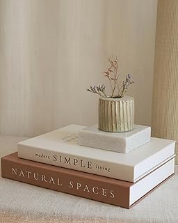
Beautiful Decorative Books
Beautiful Decorative Books – Set of 2 Boxes Enhance Your Coffee Table punches above its price — 288 buyers rated it 4.5 stars. I would buy it again.
16. Display Colorful Glassware On Open Shelving

Open shelving can easily look cluttered, but it’s also an opportunity for functional decor. I picked up a 6-piece set of heavy-bottomed blue water glasses at Costco for $18.99. I line them up on a single floating shelf in my kitchen. The uniform shape satisfies the minimalist need for order, while the deep blue glass catches the morning light and projects blue shadows against the white tile backsplash. I used to store a mix of mismatched coffee mugs on that shelf, and it looked terribly messy. By restricting the open shelf to one specific type of colorful glassware, it becomes an intentional display. The glasses are used daily, so they don’t collect dust, solving the biggest problem with open shelving.
17. Ground The Space With Statement Rugs

A rug is the easiest way to inject a massive block of color into a room without touching a paintbrush. I use a Ruggable washable rug in my dining room. The 5×7 size cost $199. I chose a design with a deep terracotta background and minimal geometric lines. The dark color grounds the light oak dining table. I used to have a cream-colored rug under the table, which was a nightmare. I spent half my life spot-cleaning coffee drips and dropped food. The terracotta color hides minor stains perfectly, and because it’s washable, I just peel it off the pad and throw it in the machine. It provides a massive foundation of color that ties the room together while being incredibly practical for daily life.
18. Stack Colorful Books Deliberately

Books are excellent tools for adding color, provided you arrange them with intent. I don’t color-code my entire bookshelf because it looks too contrived. Instead, I use two or three large, brightly colored hardcover books on a side table. I grabbed a $12.00 matte black metal tray from Walmart to corral the remotes, and I placed two bright yellow photography books right next to it. The yellow pops against the black metal. I used to stack ten books on the coffee table, and it just looked like I forgot to put them away. Limiting the stack to exactly two books makes it look like a deliberate design choice. The spines offer a thick stripe of pigment that breaks up the neutral surfaces of the living room.
19. Paint Your Interior Doors

Leaving interior doors standard builder-white is a missed opportunity. I painted the inside of my front door a deep, moody charcoal gray using a $25 quart of Sherwin Williams Peppercorn. The dark door creates a striking contrast against the pale gray walls of the entryway. It anchors the space beautifully. I place a $5.99 bunch of yellow tulips from Kroger in a glass vase on the console table nearby every Sunday. The bright yellow flowers against the dark charcoal door look incredibly sophisticated. I once tried painting a bedroom door bright teal, and it looked like a teenager’s room. Sticking to deep, sophisticated colors for doors adds architectural interest and depth without ruining the mature, minimalist aesthetic of the house. Trust me on this.
Finding the right balance with colourful minimalist decor takes trial and error. You’ll probably buy a pillow that’s too bright or paint a wall a shade that makes you wince. That’s part of the process. The key is to start small, rely on your warm neutral foundation, and strictly limit the number of colors you bring into a single room. I highly recommend starting with one high-quality, colorful textile or a single painted door edge before committing to larger furniture pieces. If you found these specific breakdowns helpful, pin this article to your home decor board so you can reference the 60/30/10 rule and the exact paint shades the next time you’re standing confused in the hardware store.
Frequently Asked Questions
How do I add color to a minimalist room?
Focus on strategic placement. Use a warm neutral base like greige, then add one or two bold items, such as a colorful accent chair, a vivid throw pillow, or a single large piece of art. Avoid scattering small colorful items everywhere.
What is the 60/30/10 rule in minimalist decor?
It is a ratio to balance color: 60 percent of the room is your dominant neutral base, 30 percent is a secondary muted color, and 10 percent is a bright accent color. This prevents the space from feeling chaotic.
Can I have colorful walls in a minimalist home?
Yes, but use restraint. Instead of painting every wall a bright color, consider painting unexpected areas like a single door, the underside of floating shelves, or using a large-scale mural on one specific feature wall.
What are the best neutral paint colors for colourful minimalist decor?
Avoid stark, cool whites that make spaces feel sterile. Opt for warm neutrals like mushroom, clay, or greige. Benjamin Moore’s Revere Pewter or Edgecomb Gray provide excellent, warm backdrops that let colorful accents stand out.
